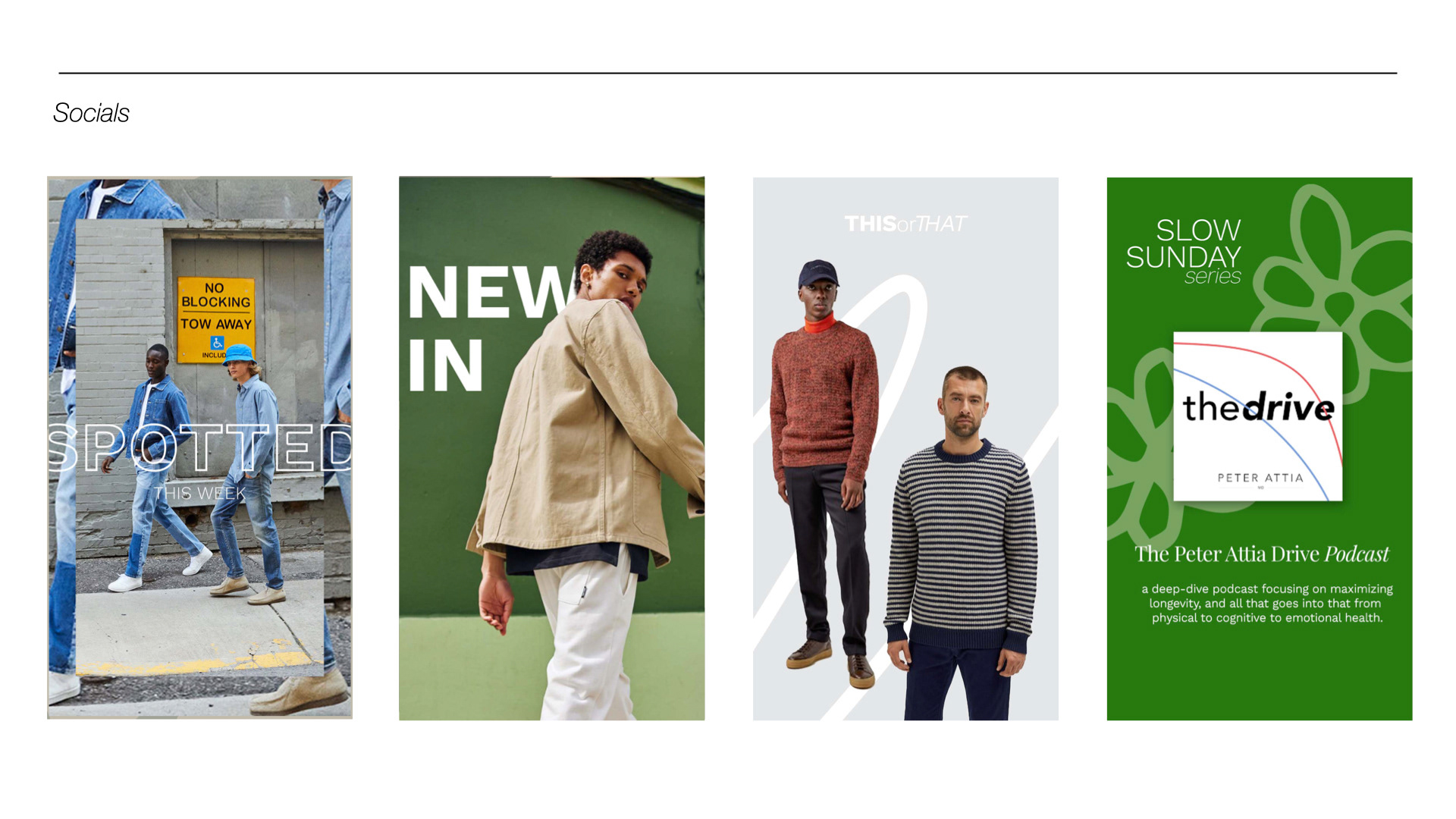
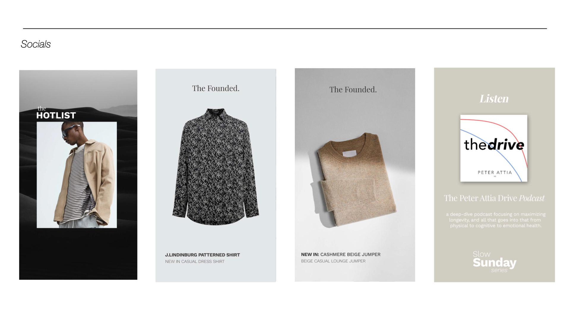
I visualised and developed the male identity of TheFounded platform. When I first started working for TheFounded, they had just launched their Male orientated shopping destination and as a result needed to update their visual identity slightly to speak to their male counterpart.
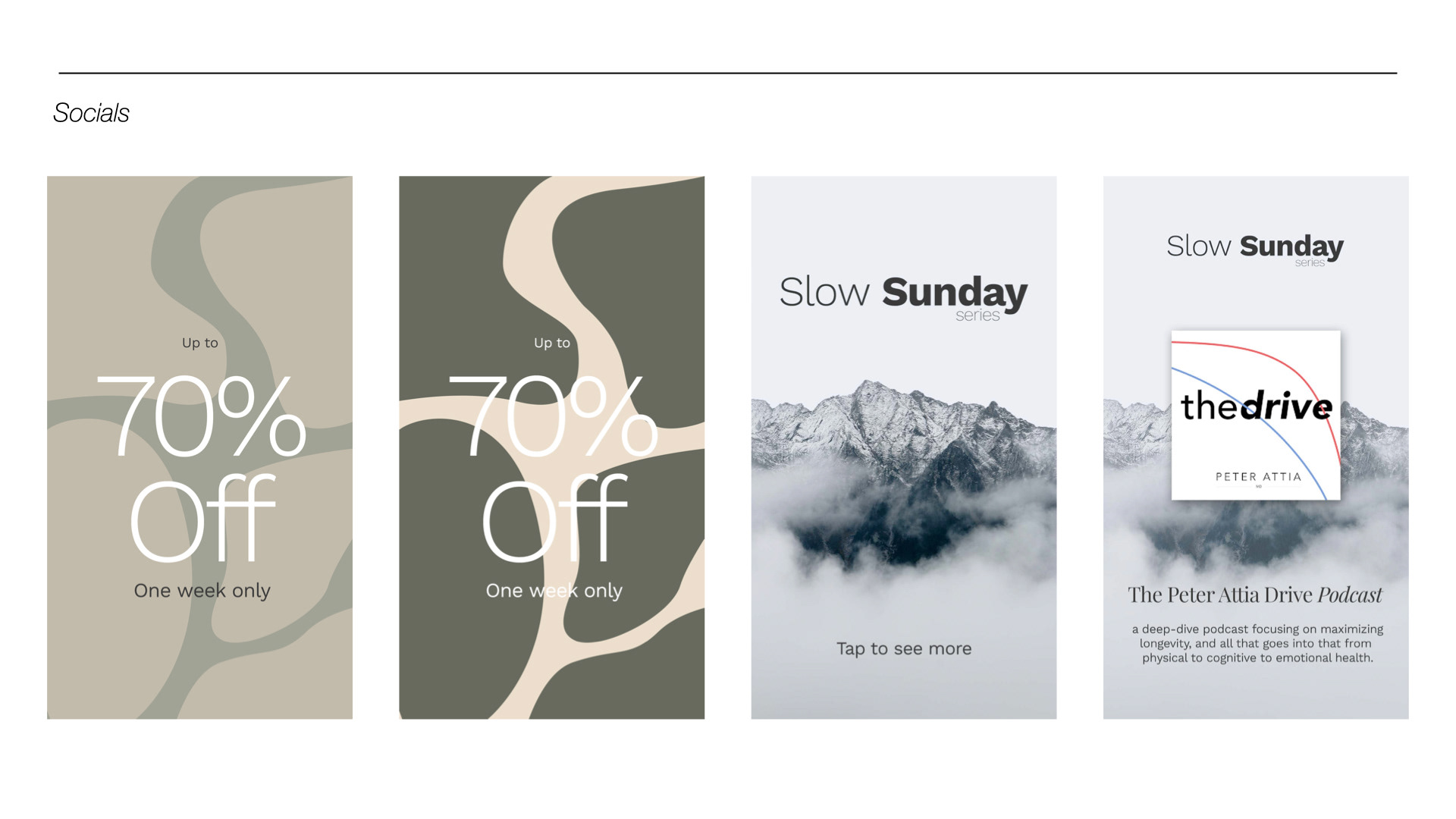
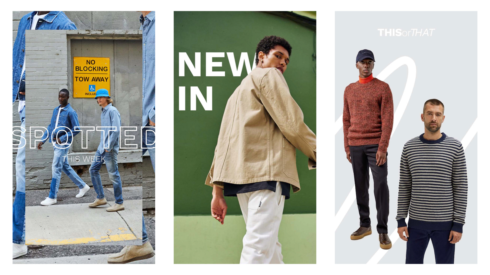
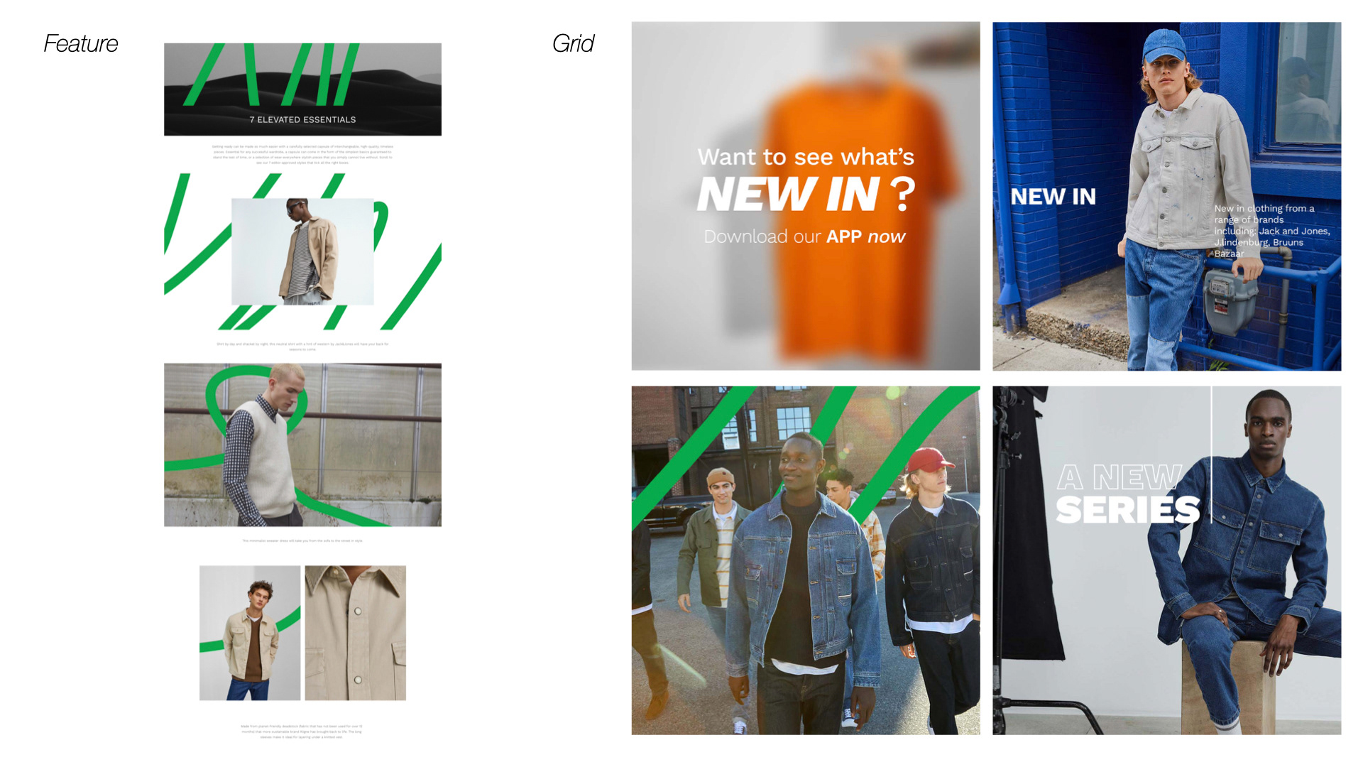
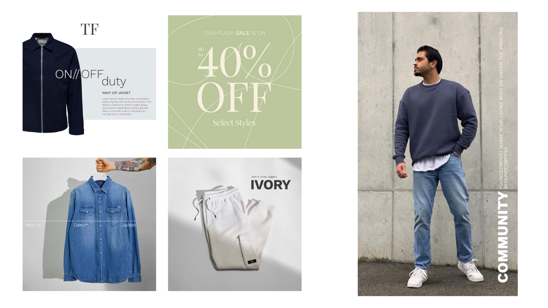
Based on research findings, a new design was crafted, emphasizing a more masculine aesthetic, including the use of bolder colors, sharp edges, and striking typography. The visual elements were adjusted to create a more streamlined and structured look that appeals to a male audience.
The website's content was also carefully curated and reimagined, shifting the focus to more gender-neutral themes and avoiding overly feminine language and visuals. The brand's messaging was revised to reflect the new design strategy and attract the target male audience.
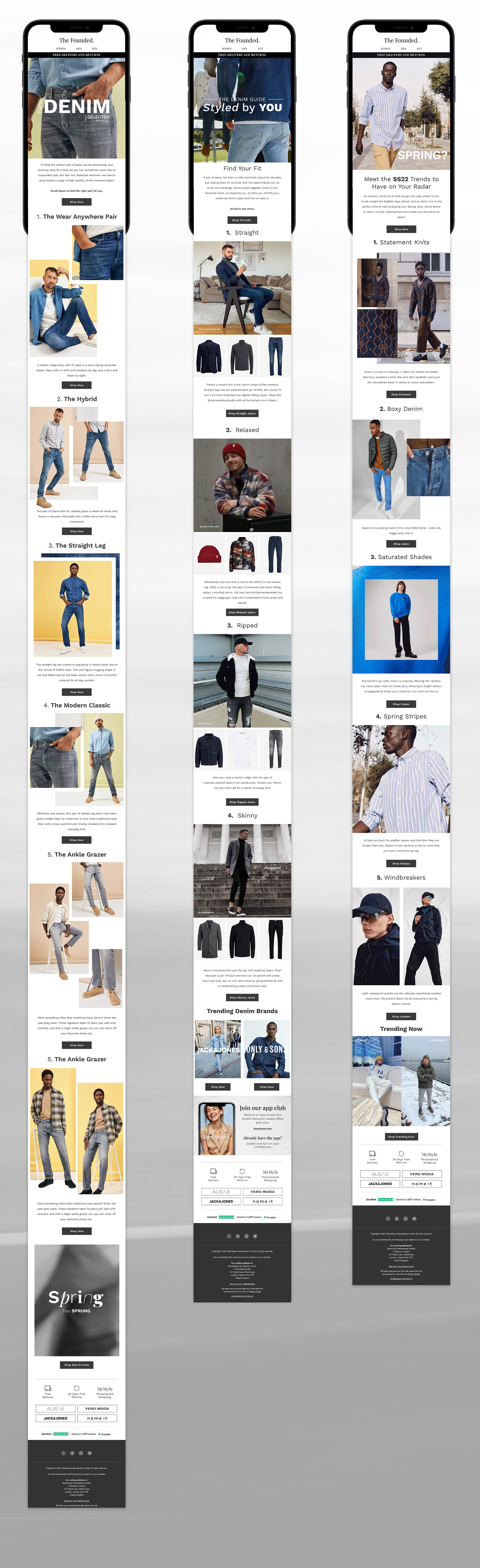
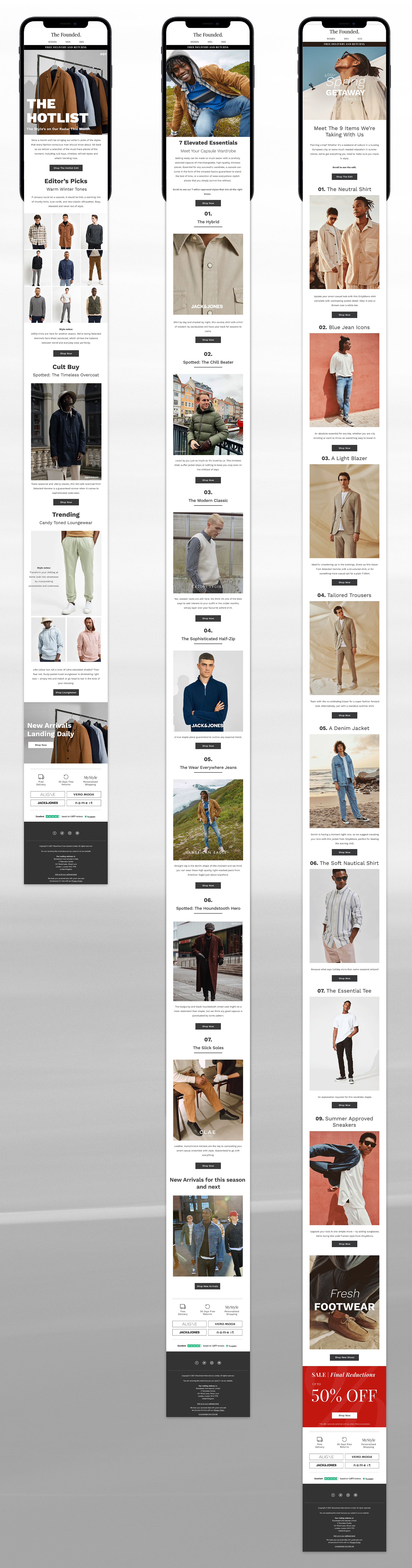
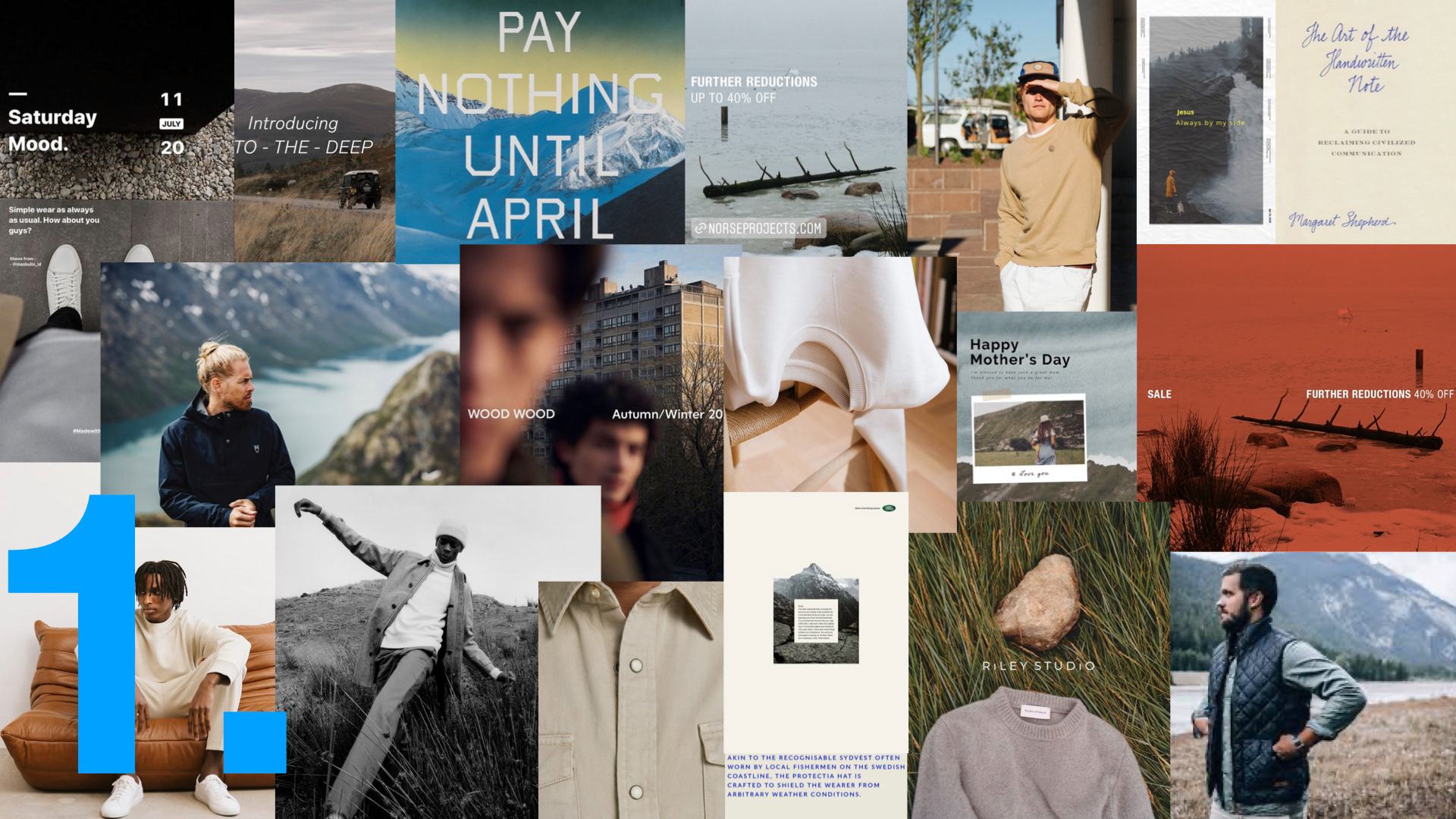
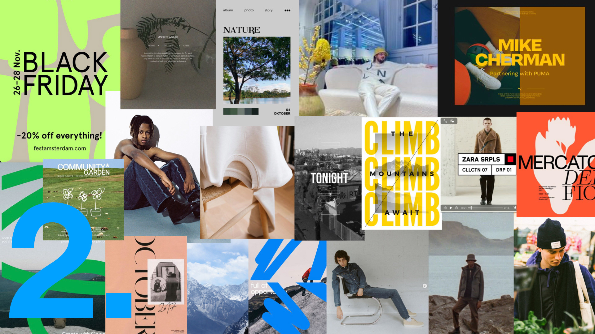
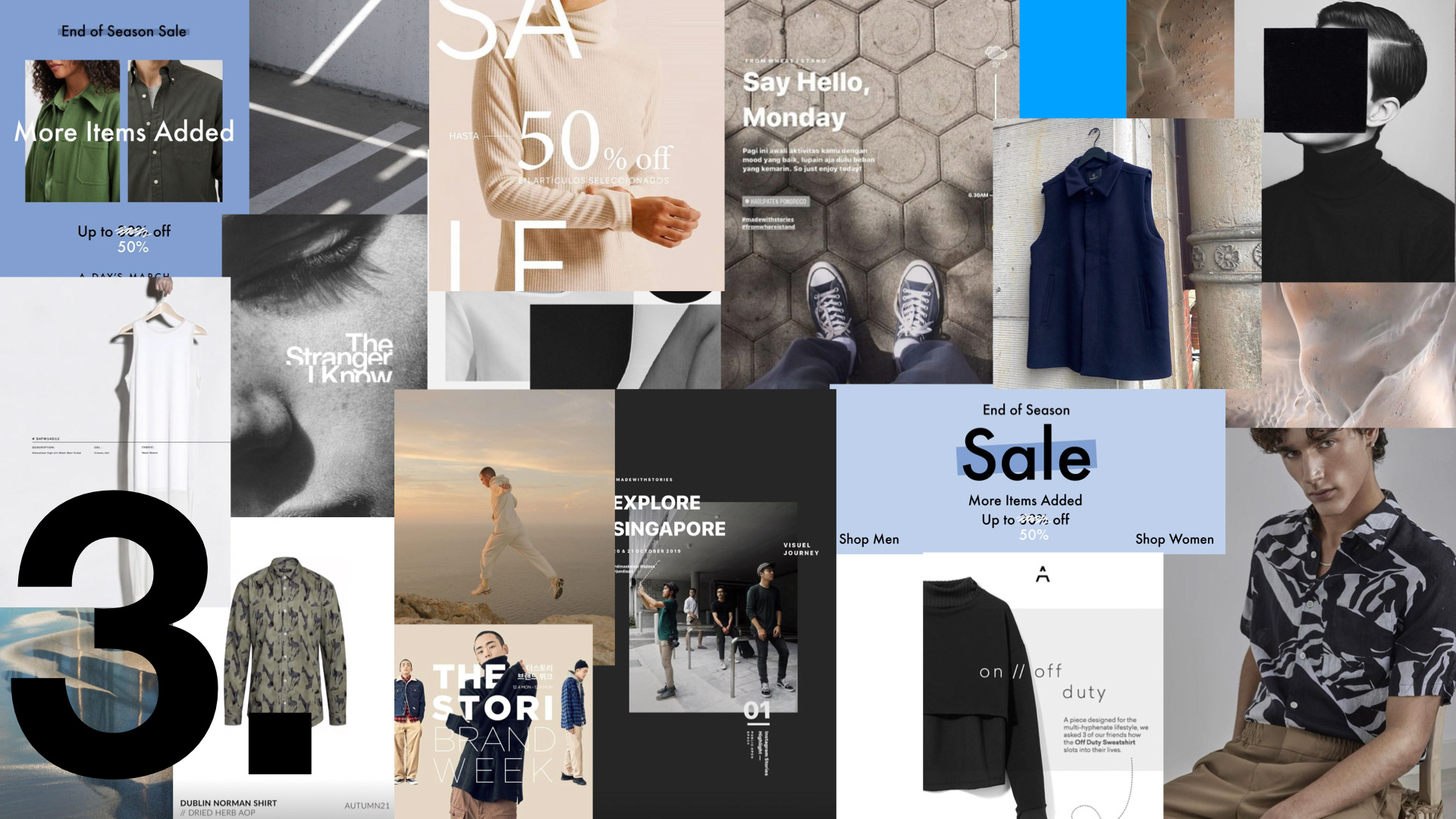
I theorised and presented 3 mood boards and artwork suggestions to the team. Since the brand just launched their male representative, I helped to reposition their identity to suit the demographic. I looked at the many clothing brands already apart of the multi-brand platform and helped to streamline the graphics to bring a new dynamism to the brand.
While TheFoundedMan speaks to the male counterpart of TheFounded, it could not stray too far from the original brand image and as a result the team opted for the 3rd moodboard as their preferred brand direction.